Slidedocs: A guide to creating slides like a management consultant

0 Preface
In my first year as a management consultant, I dedicated a considerable amount of time to sharpening my skills in crafting and delivering impactful presentations. One of the major challenges I faced in doing so was adjusting to the distinct style of presentations expected at top consultancies. The standards for creating "good slides" were vastly different from the minimalist, academic-style "TED Talk" presentations I was used to making in school.
To overcome this obstacle, it was essential for me to grasp the difference between "presentation slides" and "Slidedocs," a term coined by the renowned presentation expert Nancy Duarte, author of "Slide:ology." Having a clear understanding of these two forms of communication and knowing when and how to use them appropriately has significantly improved my ability to communicate effectively and convey a message with impact.
In this guide, I aim to introduce the concept of "Slidedocs" and provide practical tips for effectively communicating using PowerPoint, drawing upon my experience as a management consultant and insights from Duarte and other leading experts in the field. Although this guide focuses primarily on communication in business and consulting, these techniques can be applied to enhance anyone's ability to engage an audience and communicate their message with clarity and impact.
1 Introduction
- Regardless of what you do for a living, communicating is part of your job
- While this might feel like a lot of work, especially considering that you have a "real job" with real results you're supposed to deliver that have nothing to do with writing or distributing documents, spending your time clearly communicating is part of your job
- It's important to set aside the appropriate amount of time to:
- Conceptualize what you're going to say
- How to visualize it so the audience can understand
- Determine the best means to communicate it
- Business today operates in a compressed environment, so you need to create and spread thoughtful insights quickly and clearly
2 Choosing the right tool for the job
2.1 Presentations versus informed conversations
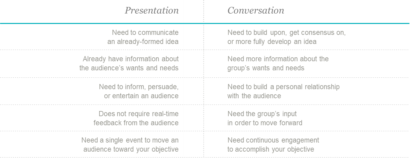
- Presentations aren't always the right tool for communicating information
- Informed conversations, where all participants have access to a common set of information, are more effective for consensus-building and decision-making
- To facilitate informed conversations, you can either give them the information beforehand or give everyone a few minutes at the beginning of the meeting to read through a document
- Before deciding on the most effective method of communication, you need to decide on your goal (i.e., what you want to get out of the time you have with the group)
- Once you've settled on your goal, you can use the table below to help you choose
2.2 Introduction to slidedocs
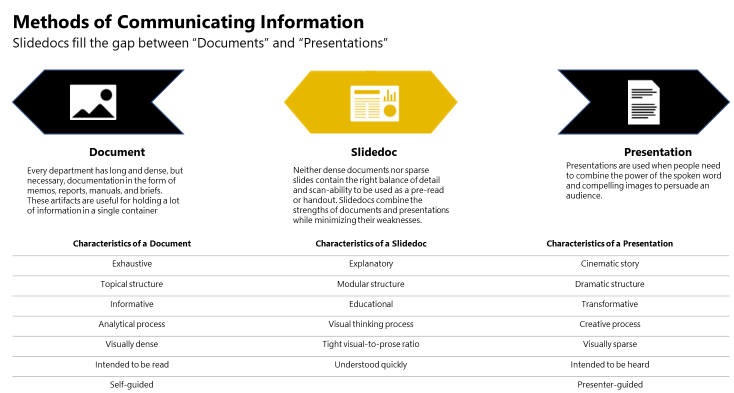
- Slidedocs are visual documents, developed in presentation software, that are intended to be read and referenced instead of projected
- Use cases for slidedocs include: pre-read materials (before), reference material (during), follow-up material (after)
- Presentation software is great for creating slidedocs because
- Ability to integrate words, visuals and hyperlinks
- Easy to learn compared to professional design software
- Pervasive (installed on most work computers)
- Can easily rearrange pages or reuse individual slides
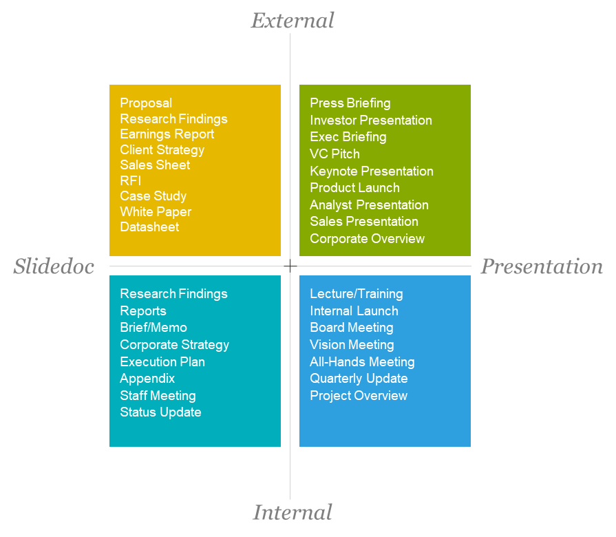
2.3 When it makes sense to create a slidedoc
- Deciding whether to create a slidedoc or presentation boils down to two questions
- Do people need you hear your message directly from you? (If yes, presentation)
- Does the subject matter require a lot of detail to understand? (If yes, slidedoc)
- Table below can serve as a guide to decide where some internal and external communications may fall on the spectrum of presentation vs. slidedoc
3 Best practices for creating slidedocs
3.1 Keep your audience in mind
- No matter your mode of communication, your audience should always be the number one priority
- You should craft your message around your audience's concerns
- People aren't motivated by what's important, they're motivated by what's in it for them, so make it evident what that is
- Take a mental walk in their shoes
- Anticipate their concerns, questions, and circumstances
- Keep these things in mind as you build out your content
3.2 Clearly state your big idea
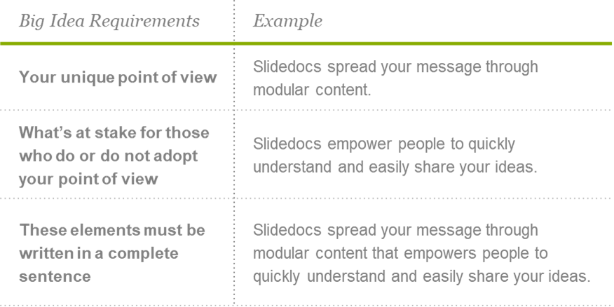
- It goes without saying that your document/slidedoc/presentation should have a point, but you'd be surprised by how many pieces of communication (from e-mail all the way to full length books) are distributed without the author ever thinking, "What exactly am I trying to do here?"
- In order to avoid pointless communication, it's important to alway determine and state your "Big Idea", which adhere to the following requirements in order to distinguish it from simply being a topic
3.3 Stick to one point per slide
- Similar to how your entire message should have a single "Big Idea", each page should focus on a single, core point
- The "one-idea-per-slide" mentality has benefits for both you and your audience
- Benefits to you: Prevents you from overelaborating
- Benefits to audience: Helps to focus their attention
- The following process can help you develop content using the "one-idea-per-slide" mentality
- Put your ideas for topics and subtopics on individual slides
- Once you've settled on a certain number of topics, these will become your page titles
- As you develop your supporting content, use the title as a litmus test to tell you whether or not you're staying on topic
- If you're overcrowding a page with words, either edit your material down or create a new subtopic on another page.
- If you do create another page, make sure that it supports the overall point you're making with your slidedoc and that it really is relevant to your audience
- If not, the content may be extraneous
- Remember, it's less about demonstrating what you know, and more about making the information easy to consume and understand in order to make the point you're trying to make, so do your best to curb the temptation to create a full explanation of everything you know about the topic
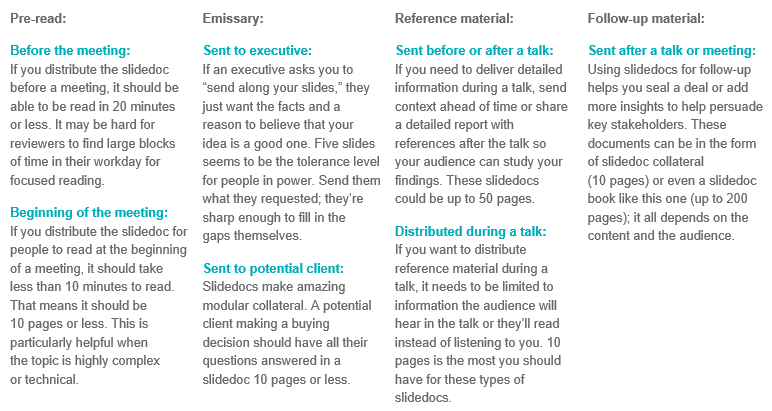
3.4 Match the length to the situation/use case
- The length of your document should depend on the use case
- For example, pre-read materials should be much shorter than reference materials
- You can use the directional guidelines below for common use cases
3.5 Follow an editorial process
- Step 1: Define your intent
- Clearly define what you're trying to do
- Step 2: Ideate
- Outline the sections that you think will be your main components
- Under each section, add pages (slide) with the titles of topics you want to cover
- Once you've created a skeleton containing all the relevant topics to support your idea, review it with your team to make sure you've covered all the main points and confirm that the overall flow works
- Don't be afraid to rearrange individual pages until you settle on a logical order
- Step 3: Create (Focus on quantity)
- Once you've captured your own and your team's ideas around topics and established a rough story flow, spill all your thoughts and research onto the pages
- Don't hold back at this step, it doesn't need to be fully formed yet, simply note down everything you think could be useful or anything that comes to mind
- Use each page as a bucket to collect concepts or ideas for each topic
- For now, aim for quantity instead of quality, which is helpful at this stage for two reasons
- You're creating a wealth of ideas and information you can choose from in the next step)
- It helps you overcome mental blocks that might keep you from capturing your best ideas
- Exhaust your subject as much as possible (time permitting) to make the next step (focusing on quality) easier
- Step 4: Refine (Focus on quality)
- Once you have your ideas and relevant supporting information collected, turn your focus to refining
- This stage involves making sure every word and sentence contributes to the main idea on the page as well as the "Big Idea"
- It makes sense to invite your team back in at this step
- You should also take a second look at the flow at this stage
- Don't be shy to keep on refining until you feel like you have the right flow and right information on each slide
- During this step, you should also ensure that information is chunked properly
- Throughout the editorial process, remember to stay focused on the best way to convey information to your audience
3.6 Structure your slides in a way that allows them to be skimmed
- As you're refining the text on your slide, start thinking about the best way to organize the information on the page itself
- Be sure to organize information in a way that helps make it easily digestible and guides readers through the message
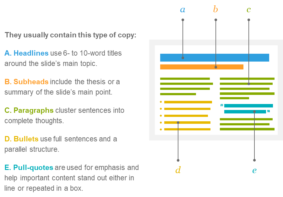
- Well structured slides usually contain the following elements
3.7 Be as concise as possible
- Clarity and concision should be your guiding principles when communicating a message
- Word counts are a useful tool for forcing yourself to be concise
- Putting in place a word count offers three benefits
- It keeps you from exhausting your audience
- It makes it easier to stay focused on a single subject
- It ensures you have room for visuals
- Communications expert Nancy Duarte has found that 100 words per page/slide is concise, with the upper limit being 250 words per page (if you need to include more words than this per slide, then you should consider creating a document instead of slides)
3.8 Develop titles with meaning
- Strong titles are important and should introduce your overall topic and your point of view on that topic
- For example, you could have the title "Network Router Options" but this doesn't tell your audience anything about the options or about what this means for them
- Instead, you could say "Fast Network Routers Speed Time to Market"
- Rather than simply informing readers that you're going to tell them about routers, you've introduced two more ideas by changing the title: 1) It's a fast router and 2) It will help your audience accomplish a goal (not a bad tradeoff for five more words!)
- Always review the title after you write the body of the slide and ask yourself three questions:
- Does the body support the title? (If not, you might need to change the title or content)
- Does the title fit within and support the greater slidedoc message? (If not, you might not need the slide at all)
- Is the title concise? (If it's longer than two lines, tighten it by cutting out the fluff)
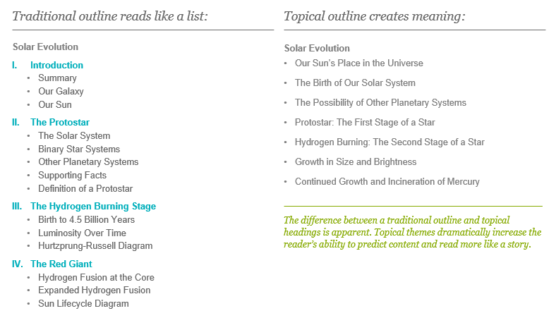
3.9 Strong titles enable topical structure
- On it's own, each title should give you a good understanding of what the page is about
- When read sequentially, well written page titles should make a logical case or persuasive arc
- TIP: Viewing your slidedoc in "outline view" enables you to read the titles in order
- Many people write fragmented slide titles that state the category instead of the point of the information
- Writing clear headlines on every page has several benefits:
- It helps your reader guess the content that follows
- It helps you during the creation and refinement processes by helping you view your slides in a context that helps you answer the following questions about your content in order to make it stronger:
- Does your content form a complete arc?
- Is the thematic intent clear?
- Does each topic build naturally onto the next?
- Are there subordinate ideas that don't need their own slide?
- Make sure your content forms a complete arc
- Check if each topic builds naturally onto the next
- If there are subordinate ideas that might require
- The difference between traditional outlines and topical headings is that the latter dramatically incresases the reader's ability to predict content and read more like a story, as demonstrated below
- Writing a summary is a great final test of your flow and titles (if you can't write a summary from a derivative of your titles, there may be a flaw in your structure)
3.10 Follow good writing practices (such as using active voice)
- While a strong title might entice your audience to read the rest of the slide, clear sentences will ensure they properly absorb the message
- Making your copy more direct can help sharpen your thinking, and the best way to do that is to use an active voice
- The active voice makes your writing sound more interesting by propelling your readers through your prose
- Grammar nerds can tell whether you're using the active voice or its evil twin, the passive voice, by simply searching for forms of the verb "to be" (a key indicator of the passive voice's presence)
- You can think of the passive voice as any wording that delays or avoids your main point
- Changing your copy from passive to active voice often means putting your subject at the beginning of your sentence and having it perform an action
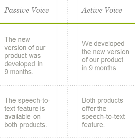
- Writing in active voice isn't always possible (some sentences are stubborn)
- The most effective authors use it as often as they can
- For more writing pointers, check out William Zinsser's classic, "On Writing Well"
3.11 Write compelling text
- The "slidedoc" format gives you a higher word count than a traditional "presentation slide", but less than a document
- This means slidedocs give you room to write in full paragraphs rather than bullets
- Writing in full paragraphs is helpful when you're looking to maximize the understanding when people are reading the document on their own
- There are a few ways you can make your slidedocs more effective (keeping these tips in mind helps people rationalize, remember your ideas, and make decisions easier)
- Use emotional appeal: Business copy tends to be cold and factual. But decisions are made from the gut before they are rationalized. Incorporate emotive visuals, shocking statistics, and stories that create an emotional response in the reader.
- Make benefits explicit: Before a reader will get on board with what you’re proposing, they need to see what’s in it for them. Make it clear what reward they will receive if they take the risk of aligning with you.
- Cite examples: Show readers examples of times when others in a similar situation made a decision to align with your perspective and had a successful outcome. Case studies and proof help people through their decision process.
- Use analogies: People respond when they can identify things as either similar or different from their perspective. Using analogies to compare the similarities and differences aids understanding.
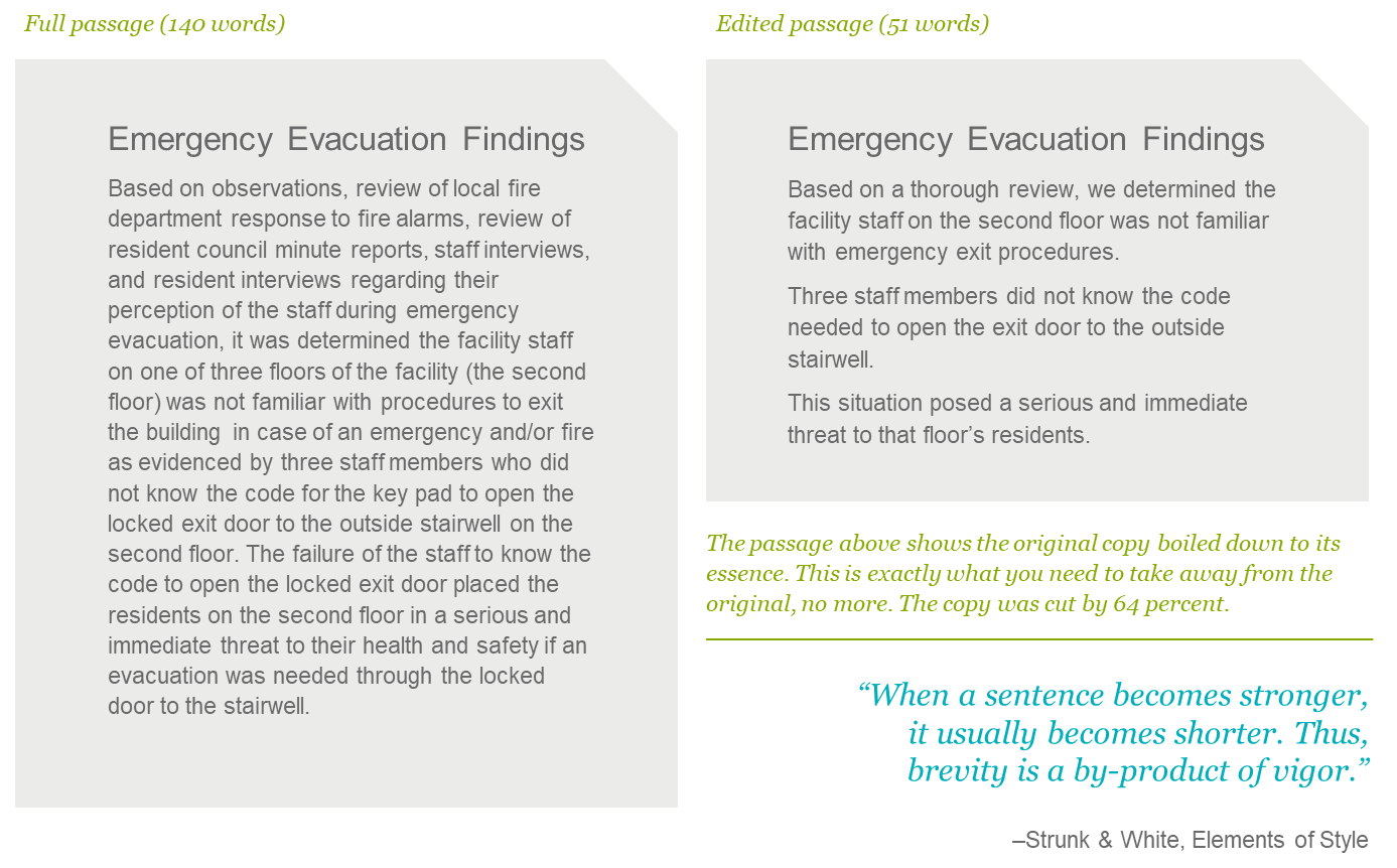
3.12 Edit the extraneous and amplify the essential
- Cutting down text is often one of the most difficult steps of the entire process
- It's often painful to delete something you spent a lot of time creating, making it tempting to justify keeping everything to avoid what writers call "murdering your darlings"
- Focusing on what you ultimately want your slidedoc to accomplish can help you refine your content
- To maximize the chances that people actually read your slidedoc rather than skim it, you need to keep it short
- Limiting the amount of content helps you maintain better control over what readers take away (the more content you have, the more choice readers have over the bits and pieces they choose to pay attention to)
- A helpful way to cut out extraneous text is to review your document, highlight the main points, and then cut the rest
- When choosing what to keep, it helps to ask yourself: "Is this one of the main points that I want my readers to take away?" (If not, delete it)
3.13 Chunk information into bite-sized pieces
- Your information is competing against a lot of distractions, so you need to take every precaution possible to make sure people consume, understand and embrace it
- There are several ways to make your content more consumable
- You can make it so entertaining that no one wants to stop reading it
- You can trim your message
- You can chunk it into bite-sized pieces
- There's a limit to how entertaining and concise your message can be, making chunking an important tool
- Chunking structures into uniform bits of discourse that build towards a larger point makes the information look less dense and intimidating to the reader, as well as easier to consume in today's hectic environment (e.g., it's easy to lose your place when reading a dense document online)
- While communicating your message using slides already forces you to chunk ideas, you can take this a step further by chunking supporting information on each slide
3.14 Critique for excellence
- When you've spent so much time with the content, it can be hard to put yourself in the shoes of someone who doesn't have as much context as you, so you might think certain things are a lot clearer than they actually are
- Getting another pair of eyes on your work can help you overcome this pitfall
- Don't wait until your draft is polished and perfect to ask for criticism from colleagues
- By putting an early draft in front of colleagues, you can feedback sooner, which will help you stay focused and avoid rabbit trails
- The input of your colleagues can also help you jump difficult hurdles, like an awkward transition, a particularly difficult concept to explain, or a dull headline
- Subjecting yourself to peer review can be painful but is very rewarding since embracing other perspectives of your work helps it reach a broader audience, and helps you grow into a stronger communicator
- Here are some of the ways that peer review can help improve your slidedoc (and which you can ask them to keep in mind as they review your work):
- Strengthen the quality of titles
- Suggest areas to cut information
- Validate the structure and flow
- Look for flaws in reasoning or execution
- Improve examples, phrases, or data
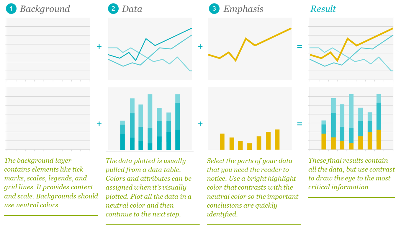
3.15 Use data appropriately
3.15.1 Draw conclusions from your data
- Data isn't just about the numbers, but the meaning/conclusions/insights/actions humans will take because of the numbers (and it's your job to uncover these elements)
- When incorporating data, be sure to include what the data means in addition to the chart displaying the data
3.15.2 Keep it simple
- Display data in a way your audience will understand
- Audiences who are analytical, financial, scientific or engineer-minded tend to look at data with a skeptical eye - if they feel your data has been manipulated or become "marketing-driven data" (with too many fancy decorations), it will feel less substantial and accurate to them
3.15.3 Highlight what's important
- You can think of a data chart of having three layers
3.16 Use diagrams to show relationships
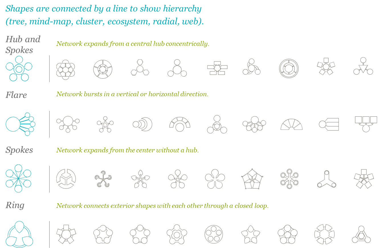
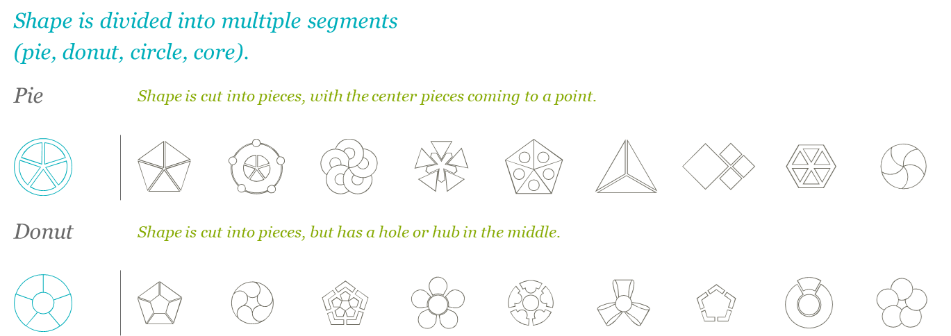
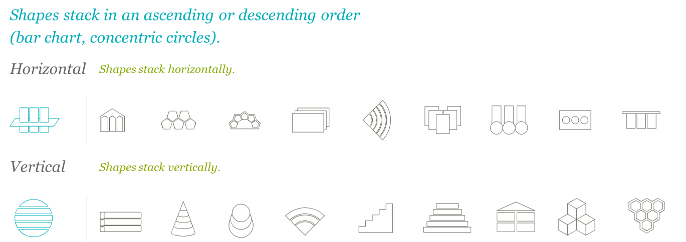
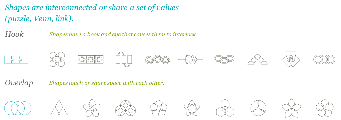
- Text-filled diagrams are a useful tool for explaining abstract concepts
- The best way to show how things relate to each other is to use proximity, scale and links so the hierarchy and relationships are clear
- Five common diagram types are displayed below with visual examples following
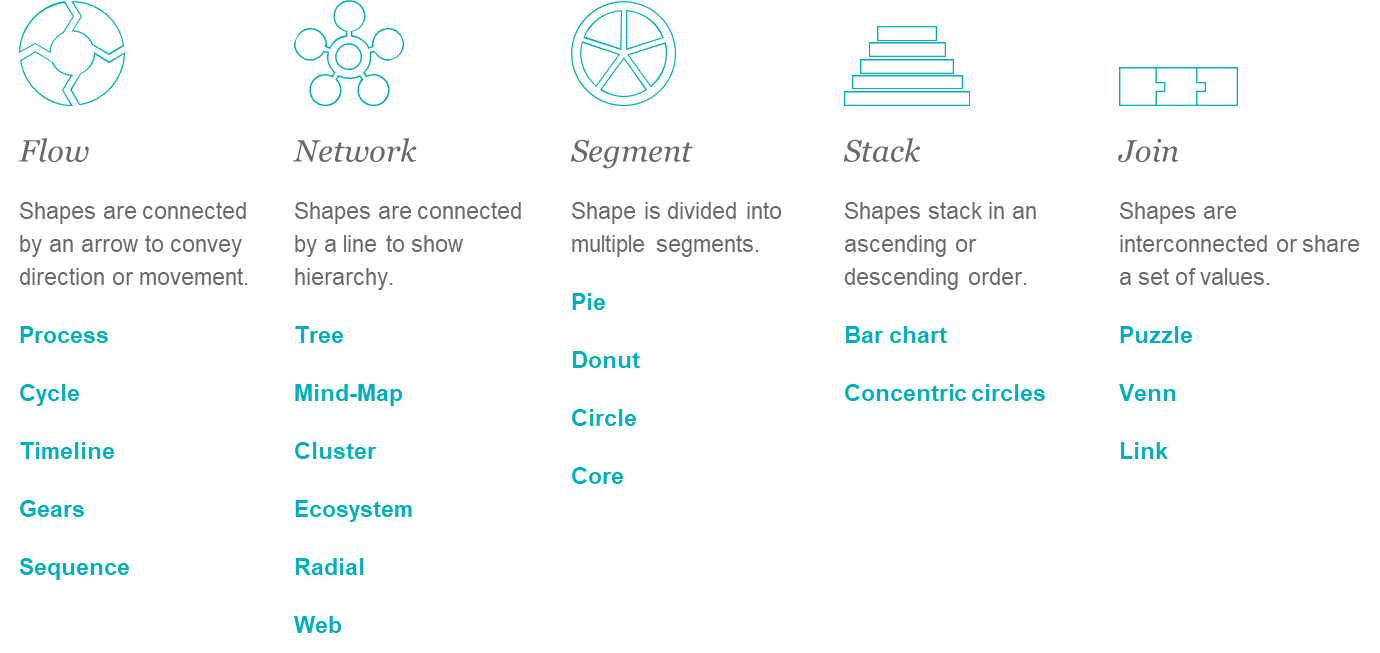
- In order to use diagrams appropriately, it helps to familiarize yourself with diagram taxonomy, which is comprised of the following categories of diagrams
- Flow
- Network
- Segment
- Stack
- Join
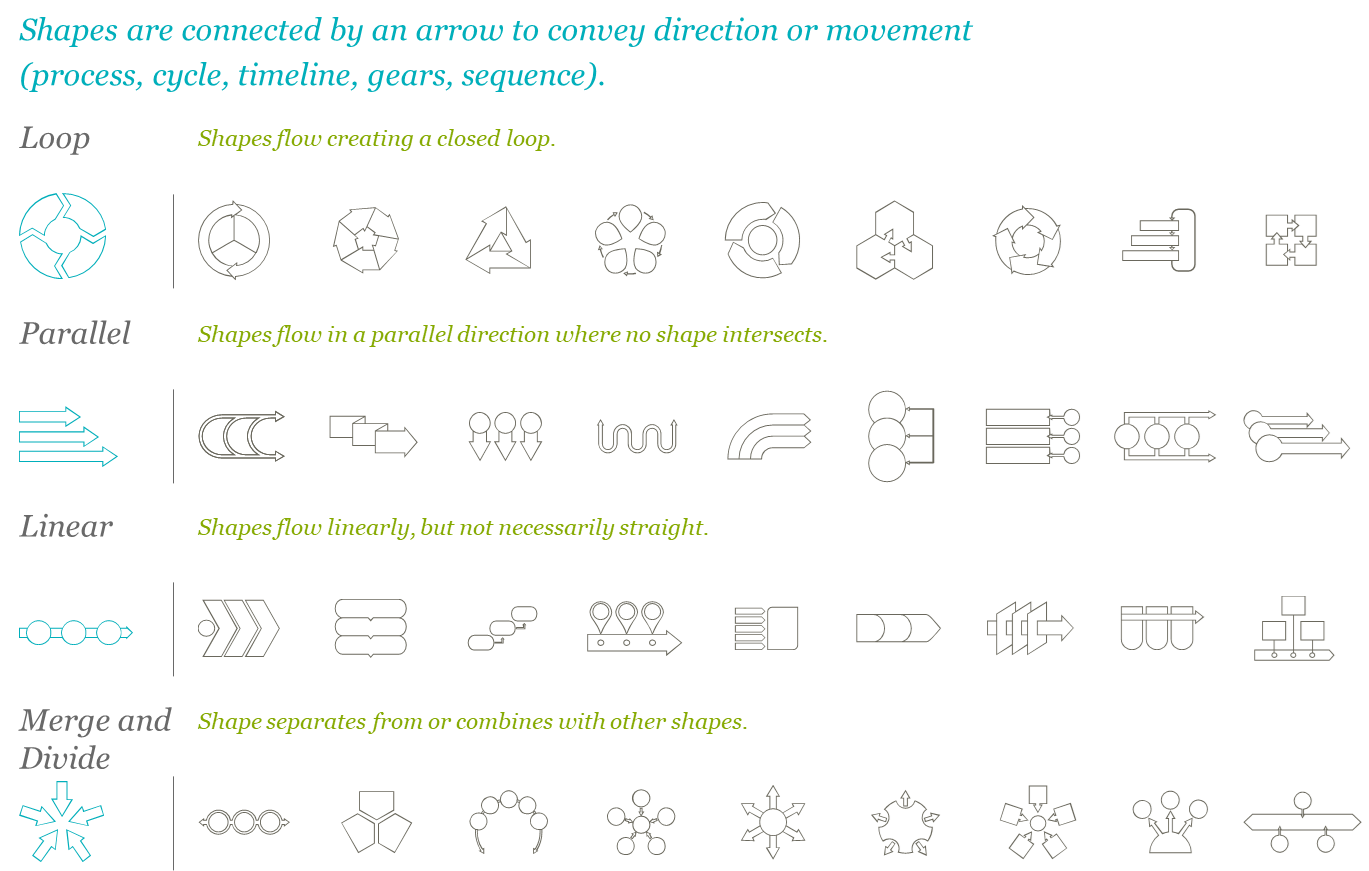
3.16.1 Flow Diagrams
3.16.2 Network Diagrams
3.16.3 Segment Diagrams
3.16.4 Stack Diagrams
3.16.5 Join Diagrams
3.16.6 Sources for Free Diagrams
- Nancy Duarte, author of the Pyramid Principle and Slide:ology has created diagrammer.com, a resource with thousands of diagrams that fit into the taxonomy of the previous page
- Go to diagrammer.com for over 4,000 free custom-made diagrams that fit into the framework outlined above
3.17 When it's ok to project slidedocs
- Slidedocs should be read or printed, not projected, but there are some instances when it is ok to project them
- Collaboration: Project a page to read and discuss it in detail to refine the idea or build consensus
- Review meeting: Project a slide to edit it collaboratively with a group
- Visual reference: Project a page from a slidedoc as a visual reference so the audience knows what page you're asking them to read
- Overlay sketches: Projecting onto a whiteboard to sketch over graphics to help clarify meaning
- Usually if slidedocs are projected, it would be in a room with ten or fewer internal people
- If you are in a room with six or more people or are presenting externally, rethink whether a sliedoc is the right medium or if you should build a presentation instead
3.18 Break bad habits
- Do not verbally present slidedocs
- Bad habit #1: Using slides as a teleprompter
- The biggest reason people present slides-as-documents is that they want to make sure they cover everything
- Presenters put every word on a slide so they don't forget what they're supposed to say
- They build what is essentially a visual teleprompter
- Audiences become frustrated when they have to sit through a presenter read-along, just like it would frustrate you to read the President's teleprompter instead of listening to the State of the Union
- Bad habit #2: Leaving no time to prepare for a real presentation
- Authors pour ideas, words, and pictures onto slides as part of the creative process
- The problem is that people stop there, with all their thoughts in writing on the slide
- If your plan is to present the material, there's an additional step you need to take to distill the document into a true visual aid
- If you don't have time to perform this step, it's best to distribute it as a document
- Bad habit #3: Thinking dense slides look smart
- People in analytical roles sometimes think the merit of an idea is directly proportional to the amount of information on the slide
- They feel that if you don't have dense charts and graphs, you haven't done your research or been through enough
- However, projecting several layers of charts on a slide is a very different experience than distributing several charts throughout a slidedoc for people to read and interpret themselves
- Bad habit #4: Desiring accreditation
- When you've worked hard on your ideas, it's tempting to present the material instead of handing it out
- Presenting material makes it clear that you're the author and subject matter expert
- This behavior is based on pride of authorship, not ocmmunication efficiency
- Regardless of why people present their dense slides, the practice should stop
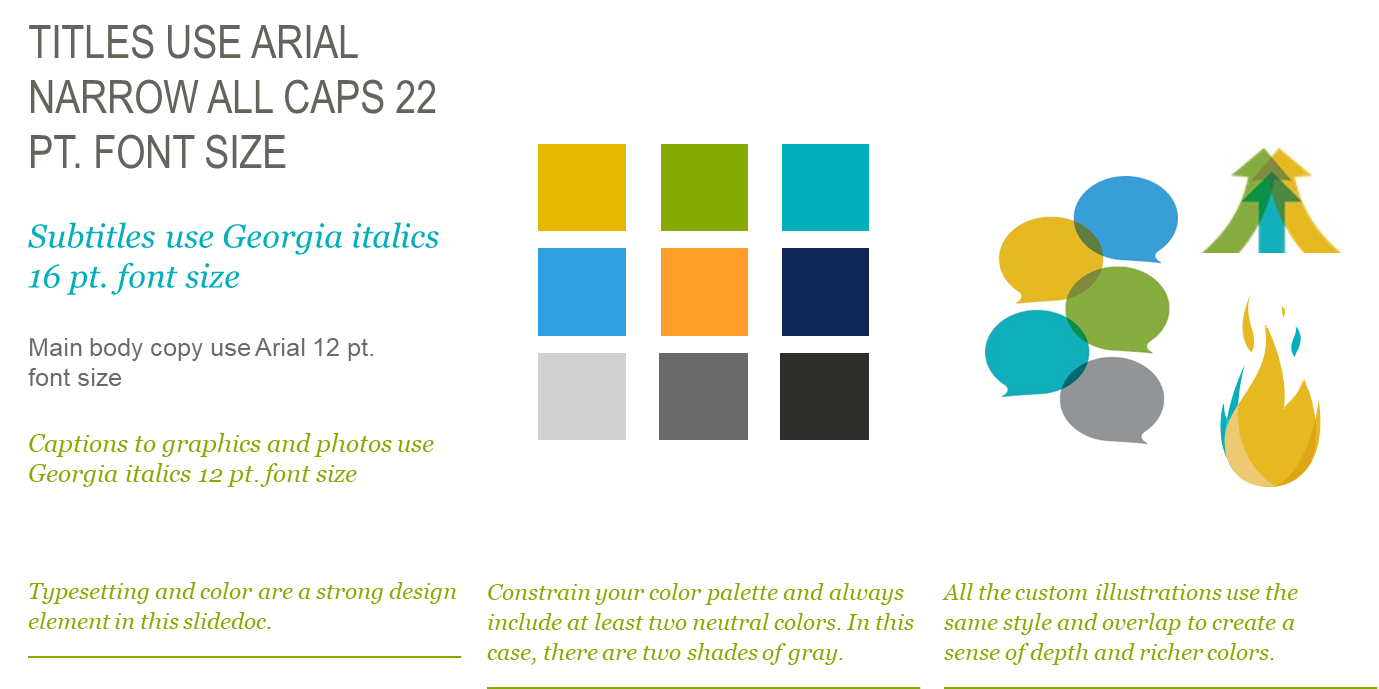
3.19 Establish a visual language/design system
- It's best practice for every organization to create a slidedoc that acts as a resource for your organization with established layout or design guidelines that a person can work with or manipulate
- This ensures consistency throughout the organization and minimizes the mental load associated with the many decisions involved in design
- Baking it into a template helps employees express your brand through slidedocs
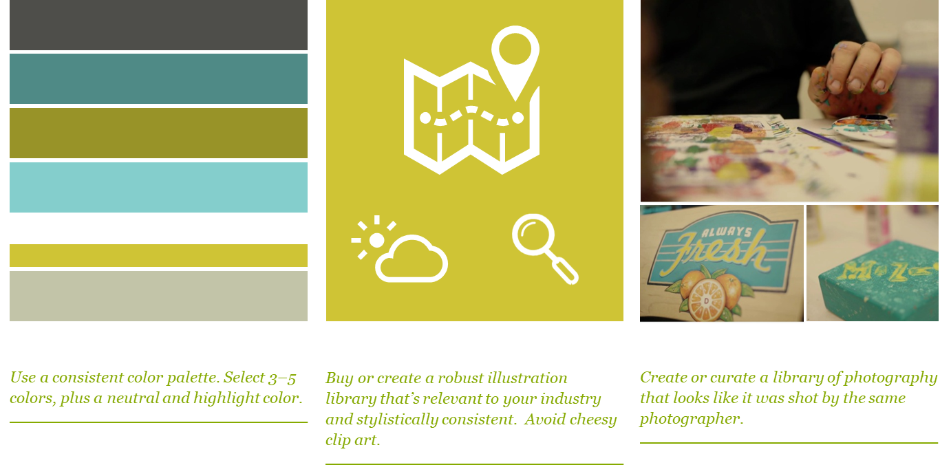
- Example of a well defined visual language
3.20 Use visuals whenever possible
- Visuals clarify ideas (people understand concepts better when visuals are used to explain them)
- Visualizing information shows you have command over the subject matter and that you care enough about it to make it easily understood
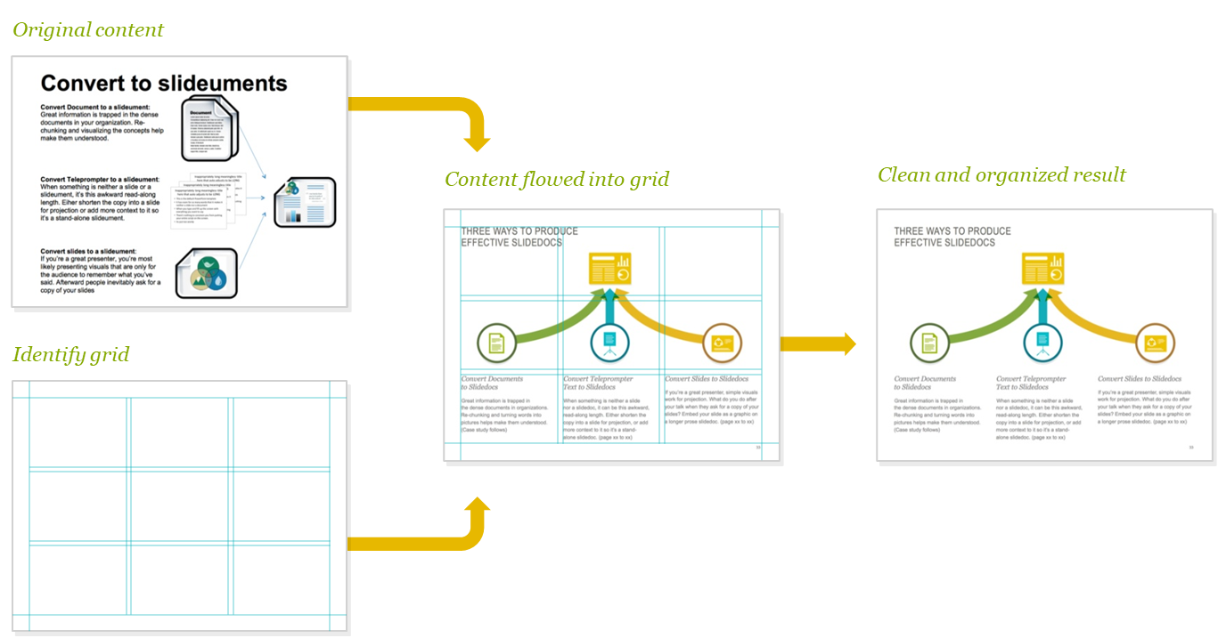
3.21 Use a grid to position content
- Humans are comfortable with structures since they help us identify things that are alike
- Grids are everywhere in nature (skeletal system, leif vein structures, etc.)
- Grids serve an important function in slides by providing structure from which to organize your images and text and keeping your layouts tidy
- Grids help you determine the placement of images and figures by giving them a spine to which they can align
- Laying out your text within a grid helps determine the width of your text
- Below is an example of a typical 4 by 3 grid (note that there are 892 unique ways you can partition a 4 by 3 grid)
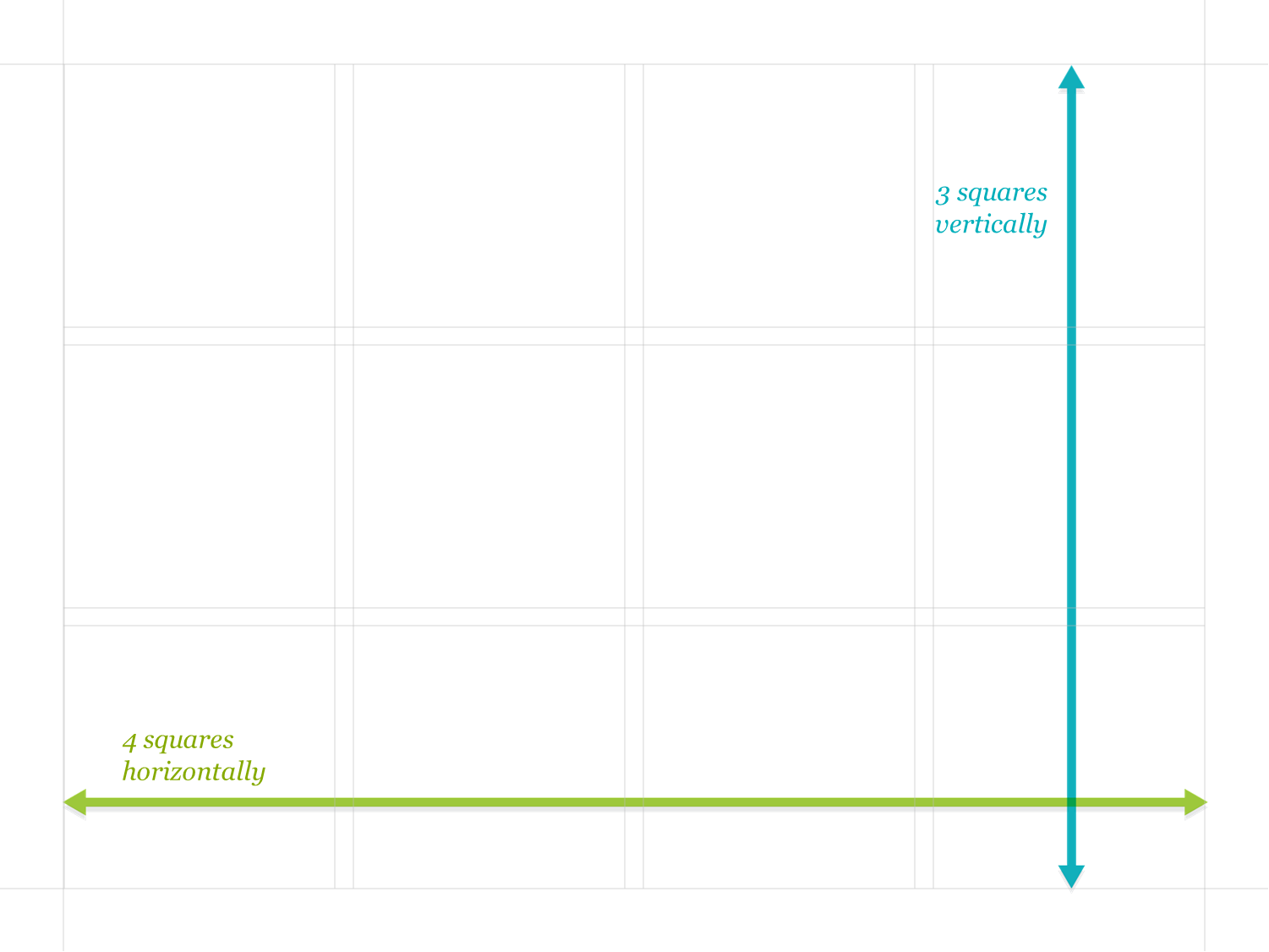
- Example of laying out objects in a slide using a grid
3.22 Let content breathe by maximizing whitespace
- Luxury brands use white space because the more breathing room you give to a design or product, the more luxurious it's perceived to be

- Proper use of whitespace in slides allows you to draw the eye towards the most important elements on a page
3.23 Pay attention to the length of your lines of text
- The ideal line length for text is based on the physiology of the human eye
- Research shows that reading slows and retention falls as line length begins to exceed the ideal width
- This can be caused by one of two problems: columns are too wide or columns aren't wide enough
- If lines of text are too long, readers get lost when their eyes return to the left side
- If lines of text are too short, the eye gets tired by needing to travel back and forth too often
- In order to optimize legibility, columns and font size should be set such that there are between 50 and 70 characters per line of text (or 12 to 15 words)
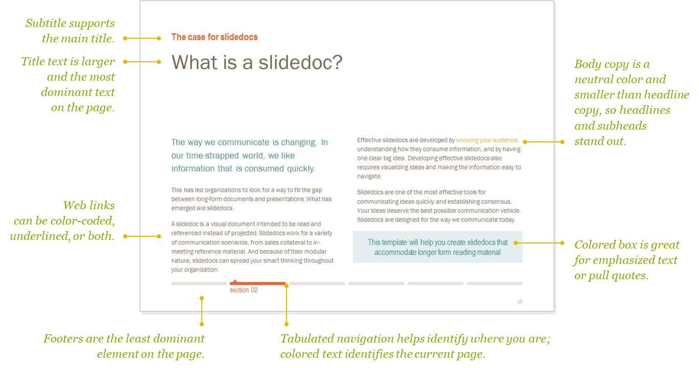
3.24 Ensure consistency by establishing a text hierarchy
- Giving readers a clear typographic system to follow will help them digest your slidedoc clearly
- Layouts help readers make a whole host of choices such as what they should read first, where the main message is, what text goes with the diagram, what's extra reading that they can skip for now, etc.
- This is why it's important to make text consistent (this doesn't mean repetitive, you'll want some variation in how slides look, but giving people an idea of what to expect makes the content more accessible)
- The most effective way to stay consistent is to establish a text hierarchy
- A text hierarchy is a set of rules that govern how individual text elements look
- For example, you may decide that the slide's title will always be in ALL CAPS in the upper left hand corner, footnotes will always be in italics, and subtitles will always be bold
- You will need to establish your own text hierarchy - these are the decisions that will make it easier for you to keep a consistent feel to your slidedoc and help your readers easily navigate your information
- You should establish your text hierarchy before you start laying out your text
- It's much easier to edit your prose using a predefined set of rules than it is to make it up as you go and continually back track if you change your mind about fonts or colors
- It's okay to test and update your text hierarchy as you lay out your slidedoc, but it's important to take time to think about the basics before you start
- When establishing your text hierarchy, it's helpful to know what people expect from certain kinds of text
- The guidelines below are helpful when establishing a hierarchy for the various textual elements on your page
3.24.1 Text hierarchy guidelines
- TITLE
- Introduces your slide and should be the first thing that people read
- Should stand out in some way (e.g., could be bolder, all caps, larger, etc.)
- Make sure it's the first text people are drawn to
- SUBTITLE
- Goes right below your title and expands on it in some way
- Should be significantly smaller than the title, but not smaller than the main text on the slide
- SUBHEADS
- Used to label the different sections within each slide
- They are the next level of the text hierarchy, so they should be smaller than the title and subtitle
- Your subheads might even be equal in size to the main copy on your slide, but you should differentiate them in some way
- For instance, they might be a bit bolder or a differnet color
- BODY COPY
- The main blocks of text on your slide
- Will take the most time to read
- Think about consumability when picking a font
- People don't read words letter by letter, they see the entire word as a picture and understand text by connecting the picture with its meaning
- Making the picture more difficult to recognize puts a barrier between your reader and your message, so classic clean fonts are the way to go
- Be sure text is big enough and dark enough so readers don't have to strain to see it
- CALLOUTS
- Small blocks of text that are used to point something out in a graph or diagram
- This text can be equal in size to the body copy, but it also needs to be distinguished in some way
- A classic way to callout text apart is to italicize it
- You can also make it a separate color
- A NOTE ABOUT COLOR TREATMENTS
- It's easy to include too many colors as you're trying to differentiate one kind of text from another
- Try to avoid creating a text rainbow and remember it is only one tool among others
- Weight, CASE, size, and italics are all good ways to set different kinds of text apart
3.24.2 Anatomy of a text hierarchy
3.25 Use proper typesetting
- Typesetting involves adjusting all the small things to make it easier to navigate your copy
- Here are some basic typesetting elements to think about
- Line spacing: Amount of room between lines of text (providing enough space helps reader keep track of their place)
- Paragraph spacing: Space between paragraphs (helps denote a change of ideas and makes body copy look less intimidating when looking at large blocks of text)
- Columns: Using columns makes your text easier to consume (splitting up big chunks of text into two or more columns improves readability)
- Alignment: Don't get fancy when aligning text, left justified usually works best (the exception being if you have a callout that needs to go with a specific graphic, in which case you should align it to the side of the text that's closest to the item you're talking about to clarify the connection between items)
- General clean up
- When you're finished adjusting the formatting of your text using the above guidelines, take a look at it as a whole
- Clean up text to avoid any right sides of lines that are overly jagged or single words or short phrases dangling at the end of a paragraph manually by using a soft break (shift + return) for that final polish
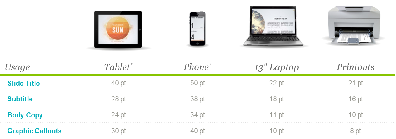
3.26 Size text appropriately to ensure readability
- The right text size depends on the device you expect readers to access your content from
- For smaller screens, text needs to be larger (so use less text, but larger in size) but only do this if you know for a fact audience will be reading from phones
- Here are some recommendations to consider for viewing on various screens
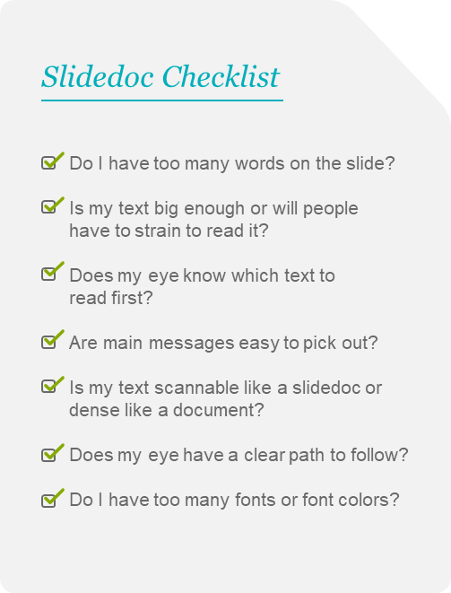
3.27 Test and review your slides
- Anybody who's ever tried to follow a complicated recipe knows that just because you've completed the steps doesn't mean your creation is going to look exactly like the picture
- Likewise, while the guidelines are helpful for laying out your slides, you should still do an overall audit to make sure your pages hang well together
- Look at your slidedoc as a whole and ensure that:
- No slides have too much text or only text
- Your pages have enough white space and breathing room
- Remember, graphic designers spend their lives studying design, so don't be too hard on yourself
- Here is a list of questions you should ask yourself when reviewing your slides
4 Conclusion
4.1 Additional reading on the visual display of information
- For a more exhaustive look into the visual display of information in presentation software, you can take a look at the following two presentation books (both convey the business case for design, explain powerful design principles, and have pages full of inspiring examples)
- Presentation Zen: Simple ideas on presentation design and delivery by Garr Reynolds
- Slide:ology by Nancy Duarte
5 Appendix
5.1 Architecture of a slidedoc
- A good slidedoc shares many similarities with a well-designed book (it combines content with a visual style, consistent formats, and clear visuals, and sequences them into a cohesive whole)
- Book design and publishing is a great source of inspiration for designing good slidedocs
- Slidedocs contain the following elements
- Cover
- Table of contents
- Headers and footers
- Section heads
- Section signifiers
- Text emphasis
- Interactive navigation
- End matter
5.1.1 Cover
- Covers should include the following elements
- Visual
- Title
- Subtitle
- Author's name
- TIP: Make your subtitle intuitive and interesting
- Instead of "Q4 Strategy", "Land Grab: Competitive shake-up in Q4" is more likely to grab peoples attention
- Your company logo should be present but not as a huge cover graphic or on the corner of every page (it should be simple and discrete, similar to a publisher's logo on a book)
5.1.2 Table of Contents
- When a reader looks at the table of contents, they should "get" what the book is about and want to read it based on how the page titles string together
- The TOC should be the last thing you write (it will be a derivative of your outline view in the presentation software)
5.1.3 Headers and Footers
- Books have headers and/or footers that indicate the section or chapter name to help orient readers
- In the case of slidedocs, the footer area is where you should add your corporate confidentiality or copyright information
- Page numbers should also be in the footer to help people navigate during meetings
5.1.4 Section Heads / Dividers
- Section heads are slides that inform readers that they are entering a new section
- Transitioning to a new section can be signified by color, bold graphic, or memorable type
5.1.5 Section Signifiers
- There are several mechanisms you can employ to help orient a reader, including:
- Tabs: Visual devices to help readers jump to any section from any page in your slidedoc
- Color Coding: Using a distinct primary color for each section
- Graphical Devices: When content in a slidedoc fits together like a system or process, you can use a diagram as a navigation device (e.g., by highlighting section that your in on the graphical device)
5.1.6 Text Emphasis
- Emphasizing or highlighting parts of the slidedoc that are most important is helpful for readers who are particularly pressed for time
- There are several ways to make text jump off a page
- Change the color or apply an effect to the text, like bold or italic
- Pull out important pieces of text and frame them with a box to make the content skimmable
- Increase the text size and place it on the page in a way that breaks or crosses the grid
- Set text in a graphic that amplifies your message with a visual metaphor
5.1.7 Interactive Navigation
- Another way to make navigating content easier for the reader is to let them jump to the content they find the most interesting
- You can do this by adding hyperlinks and inter-application links so users can jump around the material (e.g., linking sections in table of contents, adding tabs with links to different sections at the top of each slide)
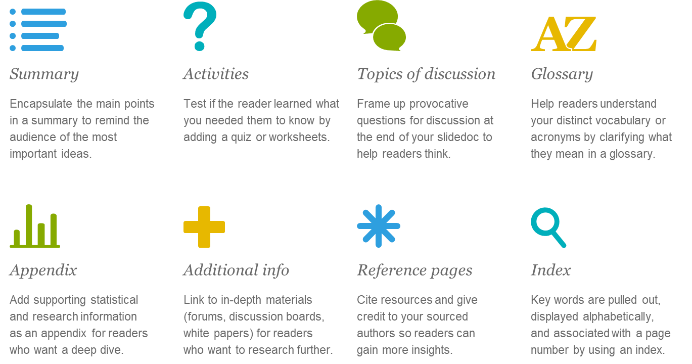
5.1.8 End Matter
- It should be clear when a reader is at the end of a section or at the end of the entire document
- Below is a list of elements that are often found at the end of sections or documents
Member discussion