Color Theory 101: The ultimate guide to understanding and applying color
1 Preface
1.1 What is color theory?
Color theory is a framework that informs the use of color in art and design, guides the curation of color palettes, and facilitates the effective communication of a design message on both an aesthetic and a psychological level.
1.2 Why should you care about color theory?
Color theory is a fundamental aspect of visual design, serving as a guide for effective color communication and application. By incorporating the principles of color theory, designers can make informed decisions and move beyond relying purely on intuition. I've personally found it beneficial in recognizing the impact of proper color usage in my designs. If you struggle with making color choices, I highly recommend gaining a basic understanding of color theory.
1.3 Two schools of thought: modern and traditional
Traditional color theory is based on the work of 18th- and 19th-century artists and theorists, such as Johannes Itten and Michel Eugène Chevreul, who developed a set of basic principles for the use of color in art and design. These principles include the color wheel, primary colors, secondary colors, and complementary colors. Traditional color theory is focused on the use of color in traditional art forms such as painting, drawing, and printmaking, which usually involve the use of pigments mixed together to create different hues.
Modern color theory, on the other hand, builds on the foundation of traditional color theory but has been expanded and updated to include new technologies, materials, and mediums. It also takes into account the use of color in digital mediums, such as web and graphic design, which has led to the development of color models specifically for electronic displays, such as RGB and CMYK. In addition, modern color theory also includes the exploration of more complex color relationships and the use of unconventional color palettes, which allows for more expressive and experimental use of color in art and design.
In summary, traditional color theory is the foundation of modern color theory, and while traditional color theory focuses on the traditional art forms, modern color theory expands on it to include new mediums, technologies and ways of understanding color perception and its effects.
1.4 The focus of this guide
Since we live in the digital age, this guide focuses on modern color theory. When researching the topic, I was surprised to find a scarcity of information on modern color theory compared to the abundance of information available on traditional color theory. Finding accurate information was a challenge as many sources appeared to contradict each other. I spent several weeks comparing and contrasting information from various sources to arrive at what I believe to be an accurate understanding of the subject.
This guide is the result of my research efforts. It is designed to assist others who may find themselves in a similar situation as I did when first wanting to learn about this topic. My goal is that it will save anyone seeking a basic understanding of modern color theory some of the time and effort it took me to acquire this knowledge.
2 Fundamental categories of color
Discussing color can be challenging due to the multiple forms in which it exists. Understanding the four fundamental categories of color - material, radiant, visual and conceptual - is crucial when exploring the various aspects of color theory. By keeping these distinctions in mind, one can gain a deeper understanding of color and how it can be used effectively in different contexts.
2.1 Material color
Material color is the physical pigment, dye, filter, pigmented or dyed material, or light source that originates the experience of color. Artists very often speak of "mixing different colors" or of "choosing colors for a painting", and what they are talking about is material color (pigments).
Material color is the sense in which we equate color with the physical world, and speak of a pigment as orange or green, or a dye as yellow number two, or talk about a white shirt or a red sky.
2.2 Radiant color
Radiant color is the mixture of light wavelengths emitted by a light source, or transmitted by a filter or other semitransparent medium, or reflected from an opaque material such as paint, ink, dye, or photographic emulsion. This defines color very narrowly, as a physical stimulus independent of any other lights or surfaces around it.
Radiant color is exactly specified as a spectrophotometric curve, which can be measured in lights, filters, surfaces and colored substances such as pigments, inks or dyes. When measuring radiant color, the principal assumption is that the surface attributes of the material color (including color unevenness, texture, gloss or mirrorlike reflectivity, iridescence, and translucency) do not significantly affect the spectrophotometric measurement.
Radiant color is not equivalent to the material color of a pigment, dye or filter: we never experience material color directly, but only through the radiant color it creates. In addition, a pigment's radiant color changes as it is diluted, mixed with different vehicles, applied to different surfaces, or viewed from different angles or under different types of light. The same "color" (material color) can produce an enormous range of different "colors" (radiant colors).
2.3 Visual color
Visual color is the perception of radiant color in a specific viewing context — usually as a physical surface in a specific place under a specific intensity and color of illumination.
Visual color literally does not exist outside individual consciousness. There is an enormous body of evidence to show that color experience is remarkably personal: it varies significantly across individuals, for a variety of reasons (genetics, age, experience). In addition, the same radiant color can appear as very different visual colors, depending on the intensity of the light and the context in which it is viewed. As a practical matter, then, the connection between a material color and visual color can be highly variable across individuals and viewing contexts.
Although visual color is personal, it does not have to be private. We can fairly reliably communicate visual color to other people through a variety of color specification strategies. When certain conditions are met, visual colors can be specified by mathematically translating the radiant color (the reflectance curve) into a color appearance specification on the three colormaking attributes (discussed below); or by finding the best visual match between the visual color and a material color sample published as a standard color atlas; or by matching the material color to a colorant mixture defined as a color "address" in a color reproduction system (such as the code "#336699" in the digital RGB color space or the formula "30-50-15-5" in the Pantone CYMK system). Note that these are not "different kinds" of color, but rather different ways to specify the material or radiant stimulus for the visual color.
2.4 Conceptual color
Conceptual color is color as an abstract concept, a sensory memory, a color label that calls to mind a visual or material color that is not present as a physical exemplar or as a visual perception. It is color defined primarily through language, memory, custom and habit.
Compared to material, radiant and visual colors, conceptual colors are simplifications in three respects: (1) they are categorical colors that apply equally to many different kinds of material or visual color (blue can refer to eyes, skies, berries, plastics, flowers, textiles, ceramics, paints, stained glass, photographic emulsions, television screens and lakes); (2) they can refer to colors that are unknown to the person to whom the color is being described ("yellow is the color of my true love's hair"); (3) they disregard variation produced by individual differences in color sensitivity and viewing conditions (a lawn viewed at twilight is still called green); and (4) they assume that color descriptions mean approximately the same thing to all people. These simplifications make conceptual colors very useful in the social framework of talking about color, but unreliable as the basis to specify color for any specific purpose.
3 Attributes of color
Vision scientists have identified three colormaking attributes — brightness/lightness, hue and hue purity — that are sufficient to precisely specify any visual color.
(Brightness replaces lightness when we want to describe lights or the light falling on or reflected from surfaces, and colorfulness replaces chroma when we want to describe lights or surfaces in comparison to an ideal or imaginary, "pure" hue.)
3.1 Brightness / Lightness
Brightness is the sensation of light emitted or reflected from an object that is greater than the light reflected from a matte "white" surface under the same illumination. Brightness is only weakly correlated with the actual luminance (i.e., light emission) of an object. For example, car headlights appear painfully bright at night, but in noon daylight they may be barely visible. The luminance is the same, but the apparent brightness varies with context.
Lightness (or Value) is the sensation of light emitted or reflected from a surface as a proportion of the light emitted or reflected from the brightest surface (or a matte "white" surface) under the same illumination. The physical basis of lightness is essentially the overall proportion of light shining on a surface that is reflected from the surface: dark surfaces reflect very little light, and pale or white surfaces reflect a lot of light.
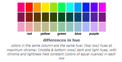
The example below shows variations in the lightness of a blue hue with low chroma.

Extremes of lightness or value are described as dark or black up to light or white; for self luminous areas (lights) the extremes of brightness are described as faint or dim up to brilliant or bright.
3.2 Hue
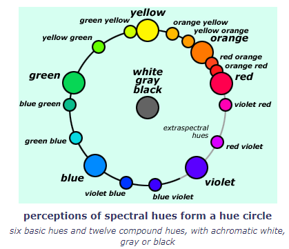
Hue tends to be the most familiar color attribute, the one that answers the question, what color is it? The example below shows several different hues.
In the physical sense, Hue is the attribute of color matched by a single wavelength of light or by a mixture of "violet" and "red" wavelengths of light. Hues arise because the light incident on a surface is reflected unequally at different wavelengths. The eye combines these different wavelengths into a single hue perception. This hue can usually be matched by the color of a single wavelength of light, called the dominant wavelength of the hue, notated as the wavelength number, e.g. a pure yellow is indicated by the wavelength number 575.
Spectral hues blend continuously, each into its neighbors, to form a circle of hues, in spectral order from red to violet. Extraspectral hues (reds and violets mixed from a blend of "red" and "violet" light) close the hue circle. Hue only specifies the location of a color around the circumference of this circle, usually specified as an angle (the hue angle) measured from an arbitrary starting hue (usually red or yellow).
Blends of the basic hues are named with two neighbor hue names, following the rule the tinting hue name precedes the dominant hue name, as adjective before noun. Thus red orange is an orange leaning toward red, blue violet is a violet leaning toward blue, and so on. This creates six basic and twelve compound hue categories. These are illustrated below, in the approximate spacing that the hues display in a visual hue circle.
3.3 Hue Purity
Hue purity is the concentration or intensity of hue independent of its luminance or lightness, commonly termed the colorfulness, chroma or saturation of a color.
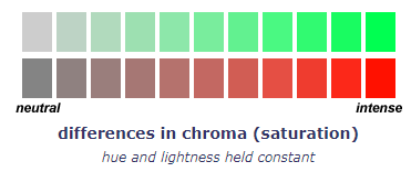
The example below shows variations in the chroma of a green and red at constant hue and lightness.
This basic attribute of "hue purity" has gone by many names — colorfulness, chromaticness, chroma, saturation, excitation purity, colorimetric purity, chromatic content, brilliance — each definition anchored to a specific stimulus attribute or color comparison. You can use either chroma or saturation to describe hue purity without worrying about the technical distinction between the two terms: • Chroma was first used by Albert Munsell in his Munsell Color System (1915), and the term now has widespread application in technical color systems. • Saturation goes back to 19th century color science; saturated color is recognized in common speech and conveys the juicy metaphor of a surface soaked in pure hue.
Chroma or saturation varies from dull for weakly tinted sensations to intense for pure hue sensations. The terms neutral or achromatic apply to colorless (white, gray or black) surfaces. (Note that lights can never appear gray or black, but only as a bright or dim.)
In visual colors (and by extension, in the material colors that stimulate the visual colors), hue purity is defined as the proportion of black, gray or white in a color relative to the proportion of "pure hue" (in materials, the pigment or dye) in the color. Colors with low chroma or saturation appear very similar to a white, gray or black. The perception of chroma forms a scale anchored in achromatic colors at one end and extending to the most chromatic stimulus at the other. In modern color models, chroma is measured from zero (achromatic) to a maximum value at the perceptual or physical chroma boundary.

4 Describing colors
The colormaking attributes provide us with a clear and simple way to talk and think about color. By now you should be understand how to describe any color in terms of:
- Relative luminance, which is lightness in surfaces (from light to dark for chromatic colors and white to black for achromatic colors), and brightness in lights (from bright to dim, whether chromatic or not).
- Hue as either red, orange, yellow, green, blue or violet; or any compound of two adjacent hue words, with the dominant hue named after the subordinate hue (as noun after adjective): red violet is a violet tinted with some red.
- Hue purity as either chroma or saturation and using the adjectives near neutral or dull (for low chroma color) and intense (for high or maximum chroma color).
- Warm vs. cool — warm colors are hues of yellow, orange and red that contain no visible blue or green; cool colors are hues of blue and green that contain no visible yellow or red; warmer colors are closer to red orange, and cooler colors are closer to green blue.
4.1 Warm and cool colors
Artists use warm to refer to red, orange and yellow hues, and cool to refer to blue green and blue hues. These terms are used to describe hue contrasts in two different ways:
- As a fundamental contrast between hues that are yellow, orange, red without a tint of green or blue (warm) as opposed to hues from green to blue without a tint of yellow or red (cool).
- As a relative contrast between two similar or analogous hues, where one of the hues appears to contain more yellow or red (is warmer), or more green or blue (is cooler), than the other.
The fundamental warm/cool contrast is typically anchored on the hues red orange and green blue, or more simply between orange and blue. Either way, the warm/cool axis is not placed through the centers of the warm and cool hue groups, because the spacing of the warm and cool hues is unequal (although each group contains about a half dozen hue categories).
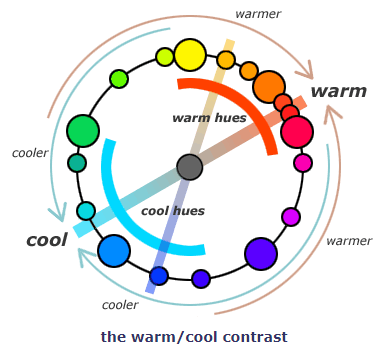
Most color theory texts categorize greens and purples as either warm or cool. This is inaccurate. The hues from green yellow to green, and from violet blue to violet red, are neither warm nor cool. In these hues blue and red, or yellow and green, visibly mix, so violet and yellow green are warm/cool hybrids. Note also that the complementary contrast between yellow green and violet is not as strident as the contrast between red and green or yellow and violet blue.
Many artists also use warm and cool to describe a relative chroma contrast between warm or cool hues: brown is warmer than gray but cooler than red orange, and iron blue is warmer than cobalt blue but cooler than gray. These distinctions are especially useful to analyze subtractive color mixtures, because blue can be made into indigo, or gray into brown, by mixing them with red or orange paint (or colored light), and red orange can be made into brown, and gray into indigo, by mixing with blue paint (or colored light).
5 Color spaces
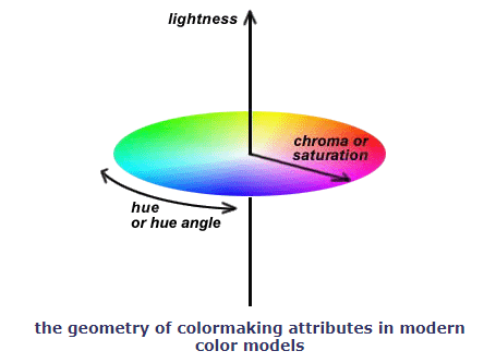
The colormaking attributes are useful because they correspond to the visually most important differences among colors, and because they can be arranged to define a three dimensional color space, the geometrical framework for all modern color models.
All colors can be uniquely identified and related to each other as locations within a color space, specified by the dimensions of brightness/lightness, hue and hue purity.
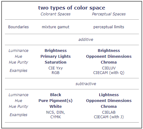
Modern color spaces are of two types: a colorant space is based on mixtures of real or imaginary "primary" colors, and a perceptual color space is based on the visual colormaking attributes.
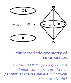
The fundamental difference is whether the color model first chooses a limited set of "primary" colorants — real or imaginary, additive or subtractive — and generates all color combinations from all possible mixture proportions of those primaries within a mixture gamut, or first defines fundamental perceptual dimensions of equal color difference, then locates colors within the perceptual limits of normal (average) color vision.
5.1 What is a color space good for?
First, it provides an unambiguous way to systematically label and display colors using the colormaking attributes: any possible combination of lightness, hue and hue purity (chroma or saturation) locates a specific point in the color space, and that point represents every surface or object with those three color attributes.
Second, a color space provides an explicit way to compare colors: similar colors will be located near each other in the color space, and very dissimilar colors will be located far apart, so we can use distance within the color space to specify the perceived difference between any two colors.
Third, the color space allows the conceptual description or grouping of colors according to their relative position within the color space — such as complementary, triadic, analogous, nuance, shade, tone or tint. Of course, this third purpose is how the hue circle, as a color wheel, has been used in traditional color theory.
6 Color models
A color model represents the logical or perceptual relationships among colors of lights or surfaces. From the modern perspective, a color model must meet the following four requirements:
- A color specification that analyzes every light or surface color into a mixture of fundamental attributes (such as "primary" colors, trichromatic cone responses or tristimulus values, or unique hues);
- A geometrical framework that locates all the possible colors in relation to each other and to the fundamental attributes;
- A unique color identifier or color notation (now usually the numerical value of the three colormaking attributes — brightness/lightness, hue and hue purity) for every possible color; and
- A definition of physical exemplars, specific mixtures of lights or paints, that recreate the measured color perception when viewed within a standard surround under standard lighting conditions.
Some of the most commonly used color models in digital media include: the RGB, HSL and HSB color models.
6.1 RGB color model
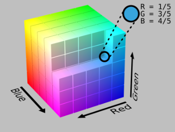
The RGB model is used when working with digital screen based designs, such as those viewed on a computer screen or phone display. In the RGB color model, a value between 0 and 255 is assigned to each of the primary colors, Red, Green and Blue, where 0 is dark and 255 is bright. By listing the three values for the red, green and blue phosphors, you can specify the exact color that will be mixed.
The RGB color model is an additive color system, which means colors get lighter when mixed. As each component of light is mixed in, the combination becomes a new color. Red, green and blue are the three additive primaries. You can create any color within the constraint of the device using different combinations of the additive primaries. When you mix all three together in balanced amounts, you get white.
Television screens and computer monitors create color by turning on the red, green and blue primaries within each pixel. By changing each of the red, green, and blue primaries within a pixel to a different brightness, the monitor creates unique colors.
Because the RGB color model is only capable of producing a certain range (or gamut) of colors, there are some colors that cannot be reproduced accurately by a computer monitor. The number of colors visible on a monitor is further reduced by the limitations of the video hardware in the computer, which may display anywhere from just black and white up to 16.7 million colors.
The RGB gamut can be arranged in a cube. The RGB model is not very intuitive to artists used to using traditional models based on tints, shades and tones. The HSL and HSV color models were designed to fix this.
6.2 HSL color model
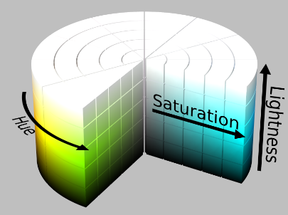
The HSL model is very similar to the RGB color model. In fact, when they're expressed mathematically, they're identical. The difference lies in how colors are expressed numerically.
The hue determines which basic color it is. Red, green, blue, yellow, orange, etc. are different hues. Saturation and luminance tell more about the variations of these basic colors. Saturation is the vividness (or "purity") of the color, i.e., how much of the color's complement is mixed in. Finally, lightness refers to the "whiteness" of the color. It may also be termed "brightness," "value" or "intensity."
Other models related to the HSL model are the HSB (Hue, Saturation, Brightness) and HSI (Hue, Saturation, Intensity) models. These terms are all similar but not interchangeable.
6.3 HSB color model
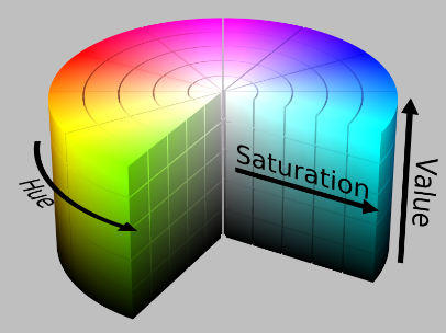
HSL and HSB (also known as HSV) are both cylindrical-coordinate representations of the RGB color model, but they use different color-encoding schemes.
HSL stands for hue, saturation, and lightness. In the HSL model, hue is represented as an angle of the color wheel (from 0 to 360 degrees), saturation is represented as a percentage (from 0% to 100%), and lightness is also represented as a percentage (from 0% to 100%).
HSB stands for hue, saturation, and brightness. In the HSB model, hue is represented as an angle of the color wheel (from 0 to 360 degrees), saturation is represented as a percentage (from 0% to 100%), and brightness is also represented as a percentage (from 0% to 100%).
In both models, hue determines the basic color (e.g. red, yellow, blue), saturation determines the intensity of the color (how gray or pure the color is), and the third dimension (lightness or brightness) determines the overall lightness of the color.
The main difference between HSL and HSB is that the third dimension of the HSL model is lightness, which is the perceived lightness of a color, while the third dimension of the HSB model is brightness, which is the perceived intensity of a color.
Sidenote: The HSB is one of my favorite color systems because of how intuitive it is to work with.
6.4 Color wheels
A color wheel is a schematic hue circle that artists use to guide color mixing and color design decisions. Contemporary artists' color wheels are essentially color order systems that show only the hue/chroma relationships as defined in a more comprehensive color model.
Isaac Newton's hue circle was intended to explain light mixtures only, and did not contain primary colors as artists think of them today. Eighteenth century "color theorists" substituted paint mixtures for light mixtures and replaced factual color relationships with simplified, symmetrical and idealized ones. This distorted Newton's concept of the hue circle and misrepresents subtractive color mixing.
7 Primary, secondary, and tertiary colors
7.1 Primary colors
It's a common misconception in traditional color theory that all color is created by the mixture of three "primary" colors. In reality, all "primary" colors are either imaginary concept colors or imperfect material colors. No visual color is "primary". In modern color theory, primary colors don't exist.
7.2 Secondary and tertiary colors
Given that there is no such thing as "primary colors", the designation of hues as "secondary" or "tertiary" has no relevance in modern color theory. In place of these archaic labels, artists use the six basic hue categories and twelve compound hue categories described in the visual hue circle in section 3.2 to denote hues. There is no ranking of importance among hues; they are all equally important in color design.
8 Additive and subtractive color mixing
Painters mix their paints to shape the light reflected from a painting, and the viewer's eye interprets this reflected light as color under light in space. These two extremes of color experience — the mixed paints, and the interpreting eye — are described by two separate and unequal color mixing theories, known as additive and subtractive color mixing.
There are two surprises when we learn about color mixture. The first is that subtractive color mixture is nothing more than additive color mixture, in an expanded form that tries to compensate for the light absorbing effects of material mixtures.
The second is that additive color mixture is a rigorous explanation of color vision, a true scientific theory; but subtractive color mixture is only an idealized and unreliable approximation of the actual complexity and diversity of material color mixture.
8.1 Additive color mixing
Additive color mixing explains how the eye interprets light wavelengths in the perception of color. Additive mixture is always based on four primary colors, called the four cardinal lights. These are most commonly red orange, middle green, blue violet, and the white light defined by mixing all three colored lights together. The white light defines the relative brightness or tinting strength of the three chromatic lights, so that they can be used to define color mixtures precisely. This trichromatic foundation is in turn the basis for all modern chromaticity diagrams, the identification of visual complementary colors, and the definition of modern trichromatic color models.
Additive mixtures occur in the eye
The beauty of additive color mixing principles lies in their narrow scope. They focus on a single sensory process — the average or typical responses of the L, M and S photoreceptors to light — for the explanation of color mixtures.
An ideal additive primary color must stimulate only one type of receptor cone (L, M or S) as strongly as possible, and stimulate the other two types of cone as little as possible. It turns out that the optimal choice of physical lights for additive color media are typically orange red (R), green (G) and violet blue (B).
It is a common misconception that additive color mixture is a theory of how light mixtures behave. This misconception arises because light is obviously the only stimulus that the eye responds to, and because lights of various colors are explicitly manipulated in color matching experiments used to measure additive color mixtures. But light is the stimulus, and additive color mixing describes the response of the eye to a light stimulus.
It's handy to think of additive mixing as the "white" color theory. Mixing light wavelengths from the "red," "green" and "blue violet" parts of the spectrum adds luminosity and negates hue to shift the mixture color of lights from dim pure hues toward bright whites.
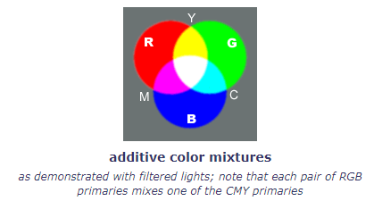
The key principle is that the eye always adds together all the wavelengths of light incident on the retina — nothing is lost — and it is this total light sensation that the eye interprets as color.
A scientific theory of color vision
For many centuries, the behavior of color mixtures was difficult to explain because material color, which seemed to be anchored in "real" objects of the external world, was conceptually distinguished from the "illusory" colors in rainbows or prisms. The two types of mixtures behaved differently, but the reason for the difference was unknown.
The trichromatic theory provided the clarifying explanation and prediction of all color sensations as arising in the behavior of the eye. Because the L, M and S receptor responses can be predicted mathematically from the summed intensity of all wavelengths in a light stimulus, the additive primaries empirically connect a measurable light stimulus to a measurable (matchable) color sensation — at least, in experimentally restricted viewing conditions. This is what makes additive color mixing, in the scientific sense of the word, a theory of color vision.
8.2 Subtractive color mixing
Subtractive color mixing is, in comparison to additive color mixing, a flawed attempt to describe the colors that result when light absorbing substances are mixed. It is not a rigorous theory at all, but rather a description of the way colors should mix in the ideal case. Subtractive mixing theory imitates the main features of additive color theory, and to understand why subtractive color mixing does not accurately describe the colors of substance mixtures, we need to unmask these points of imitation one by one.
The principles of subtractive color mixture are not a rigorous theory at all. They are a description of the way colors should mix in the ideal case — which never occurs.
Subtractive mixing theory imitates the main features of additive color theory, and to understand the problems with subtractive color mixing, we need to unmask these points of imitation one by one.
Subtractive mixtures occur in substances
First, let's get clear on what subtractive mixing rules are trying to explain. All subtractive color mixing occurs in the external world, in a wide variety of material colors.
In additive color mixture, thanks to additive metamerism in lights, even though two colored lights may be constituted from very different combinations of light wavelengths, so long as the two lights have exactly the same color, they will behave exactly the same in all mixtures with all other lights.
In subtractive color mixture, exactly the opposite is true: even when two materials have exactly the same color, they may not behave the same in mixtures with other materials. This unpredictable connection between between a material's physical attributes and color mixing behavior is referred to as substance uncertainty.
The essential point is that we cannot use the measured color of two paints to predict the color of their mixture. This is the most important point of difference with additive color theory, where the measured color of two lights of moderate brightness can accurately predict the color of their mixture.
A subtractive mixture absorbs all light wavelengths that each colorant absorbs by itself. Subtractive mixture always increases the darkness of material colors; if we mix a white paint with a green paint, the white paint is darkened as a result. If additive mixture is the "white" color theory, then subtractive mixture is the "black" color theory.
Mixing all three subtractive primaries produces a dark neutral, the opposite of white, because each paint subtracts or absorbs light that might be reflected by the other. Subtractive color mixtures can only be made lighter by diluting the amount of pigment in the mixture with white paint or water; either remedy weakens the color saturation.
Subtractive primaries
An ideal subtractive primary color must stimulate two types of receptor cones (L and M, or L and S, or M and S) as strongly and equally as possible, and stimulate the third type of cone as little as possible.
The CYM Subtractive "Primary" Colors. Subtractive color mixtures have been recognized and used in dyers' and painters' trades since ancient Greece. That long trial and error practice fixed on red, yellow and blue as the subtractive primary colors. This attained the status of a commonly accepted "color theory" in the 18th century.
In fact, the traditional choice of primary colors was limited by the historical availability of suitable pigments, which until the late 19th century were comparatively dull and dark. These traditional subtractive primaries are relics of traditional color theory.
Color choices today have been greatly expanded by modern industrial chemistry, so that the modern subtractive "primary" colors are cyan, yellow and magenta (abbreviated CYM).
8.3 Don't Confuse Additive & Subtractive Mixtures
At this point you should understand that all color mixing involves the retinal response to light; the only issue is whether or how we let material substances interfere with our control of the light that reaches the eye.
Because subtractive color mixing (in materials) is actually an indirect manipulation of additive color mixing (in cone responses), the two types of color mixture can be demonstrated in superficially similar ways. To avoid confusion, remember that the fundamental difference is whether light wavelengths are excluded by the colored substances before the light reaches the eye (the light mixing occurs in the external world), or light wavelengths are separately able to reach the receptor cones (the light mixing occurs in the eye).
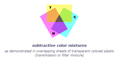
With colored transmission filters, the additive color mixing demonstration is produced by placing a colored yellow filter over one beam of white light, and a blue filter over a second beam of white light, then overlapping the two colored beams on a reflective surface. Because each filter is placed over a separate beam of light, the blue and yellow lights are both reflected to the eye, where they both affect the receptor cones to create the sensation of "white" light. In contrast, the subtractive color mixing demonstration is produced with the same yellow and blue filters, this time both placed over a single beam of light. The two filters then act in combination to absorb light before it ever reaches the eye; the only wavelengths that can pass through both filters at the same time are in the "green" section of the spectrum, so green is the color we see.
8.4 Painters' Color Mixing Terminology
Painters long mixed colors by combining relatively bright pigments with black and white. Mixtures with white are called tints, mixtures with black are called shades, and mixtures with both are called tones.

9 Color harmony
In color theory, color harmony refers to the property that certain aesthetically pleasing color combinations have. Color harmony has been a topic of extensive study throughout history, but only since the Renaissance and the Scientific Revolution has it seen extensive codification. Artists and designers make use of these harmonies in order to achieve certain moods or aesthetics. Most traditional theories of color harmony prescribe the manipulation of two colormaking attributes while holding a third attribute constant. These combinations create pleasing contrasts and consonances that are said to be harmonious.
There doesn't appear to be a single widely accepted theory on how to achieve color harmony. Some of the more widely known approaches to color harmony include:
- Newton's hue intervals
- Rumford's complementary colors
- Arnheim's concords and discords
- Chevreul's empirical color harmonies
- Birren's colorant harmonies
- Munsell's perceptual harmonies
- OSA uniform color scales
- Coloroid hybrid harmonies
9.1 Principles of color harmony
Most traditional theories of color harmony prescribe the manipulation of two colormaking attributes while holding a third attribute constant; in this respect the hue mixture theories of Newton and Arnheim are primitive, despite their conceptual elegance.
Looking back across three centuries of color exploration, we can glean the following twelve principles from the historical study of color harmony:
- Color harmony is traditionally defined as (1) proportions or ratios between fundamental color qualities (such as "primary" colors); (2) straight line samples drawn within a color space, the lines being divided into scales of equal or geometric color intervals; or (3) consistent relative locations around the hue circle (in particular, analogous and complementary hues).
- Colors harmonize when they are variations within the achromatic grayscale (achromatic harmony).
- Colors harmonize if they are variations in lightness and chroma within a single hue (monochromatic harmony).
- Colors harmonize if they are variations of constant saturation across lightness within a single hue (shadow harmony).
- Colors harmonize more, the smaller the hue difference between them (analogous harmony).
- Colors harmonize more, the smaller the chroma difference between them, regardless of lightness or hue (chromatic harmony).
- Colors harmonize if they are the same lightness and chroma, regardless of hue (nuance harmony).
- Colors harmonize more, the greater their average lightness, regardless of hue (brightness harmony).
- Colors harmonize more, when there are moderate but not extreme lightness differences among them (lightness variety).
- Colors within a perceptual color space assort best if they are selected to lie on a single plane oriented at any angle to the lightness and opponent hue dimensions (plane harmony).
- Colors harmonize more, when lighter valued and/or more saturated colors occupy a smaller visual area than darker and duller colors, in proportions equivalent to the degree of color differences among them (color proportion harmony).
- Colors harmonize less and contrast more the larger the hue difference between them (hue contrast).
- Colors contrast most pleasingly if they are complementary hues (complementary contrast).
10 Traditional hue harmonies
Traditional hue harmonies refer to the color harmony patterns traditionally taught in visual design classes and art texts. They provide a standardized vocabulary for identifiyng color combinations or palette designs.
These are not really color harmonies, because they are defined only in terms of hue relationships around the hue circle — red and yellow are analogous colors, red is the complement of green, and so on. The colormaking attributes of chroma and lightness are not considered. These are called hue harmonies to distinguish them from full color harmonies that include hue, lightness and chroma.
Traditional hue harmonies are defined on the circumference of the hue circle, as the most saturated colors (light valued yellow, dark valued violet, mid valued red, and so on); derivative or "broken" colors — unsaturated tones, tints and dark valued shades — are equated with the saturated hue. In this way the hue harmony can be adapted to almost any specific color scheme or selection of paints for a palette.
Most color designs are dominated by a single hue, the key color, around which all the other colors are organized. This can be a mother color if most or all other colors are mixed with it. Otherwise the key color represents the overall color impact of colorant mixtures. Once you've identified the key color, then the color harmony emerges from the relationship of the other colors to it.
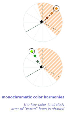
10.1 Monochromatic
The simplest color scheme is made of a single hue that varies only in saturation and value. This is the monochromatic color harmony. It corresponds to Chevreul's harmonies of scale: a single colorant mixed with white and/or black.
To create a monochromatic palette, (1) choose a key color at the edge of the hue circle, and (2) mix this color with white and/or black in any proportions
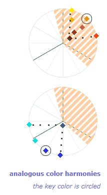
10.2 Analogous
The next color harmony consists of neighbor hues along the circumference of the hue circle.
There is no fixed rule for the range of hues permitted in an analogous color scheme; depending on the choice of key color, the range can vary from 45° to 90° on the visual hue circle. The key color is usually near the center of the hue range, but can be at either end.
However a good rule of thumb is that analogous color schemes only include colors in which the key color is the dominant hue. If the key color is orange, analogous hues range from orange yellow to orange red (excluding yellow and red); if the key color is blue, the hues can range from blue green to blue violet (excluding green and violet). These schemes never include both warm and cool colors, as these are color opposites rather than color siblings.
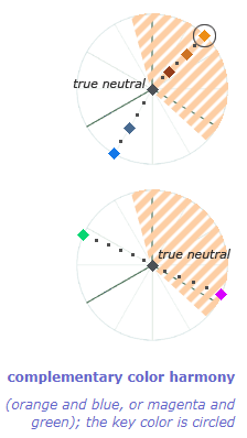
10.3 Complementary
Probably the single most important color relationship in traditional color theory is defined by complementary colors, two hues that are roughly opposite each other on the hue circle.
To create a complementary color harmony, (1) choose a key color at the edge of the hue circle, then (2) choose a color opposite to it on the hue circle. You are permitted to include any color mixture along a line between these two, and to use any mixture of those colors with white, black or a dark neutral.
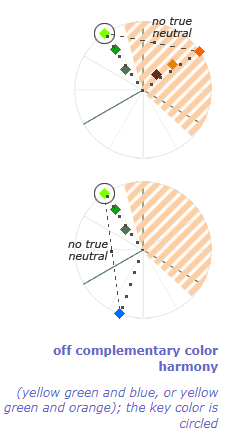
10.4 Off Complementary
Off complementary colors refers to two hues separated by roughly a 120° angle (one third of the circumference) on the hue circle.
To create an off complementary color harmony, (1) choose a key color at the edge of the hue circle, then (2) choose a color approximately one third of the circumference in either direction around the hue circle. You are permitted to choose any colors mixed from these two, along a line between these two, and any mixture of those colors with white, black or a dark neutral.
10.5 Split Complementary
One of the most popular color schemes for expressive color effects, the split complementary color harmony simply adds analogous hues to one side of a complementary color pair.
To create a split complementary palette, (1) choose a key color at the edge of the hue circle, (2) choose a color opposite to it on the hue circle, then (3) choose analogous colors on either side of the key color, and (4) choose any unsaturated colors within the color area spanned by the saturated colors. You are permitted to use any mixture of these colors among themselves and with white, black or a dark neutral.
The key color is bracketed by the analogous colors ("split" complements); the opposite complement is the accent color to the key color. This puts the emphasis on the key color in two ways: by accenting it with its complementary color, and by extending its color resonance through analogous hues.

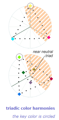
10.6 Triadic
Along with complementary colors, the triadic color harmony has been extremely important in traditional color theory. It originally consisted of the three "primary" colors red, yellow and blue in this form it is the basis for wide range of palette designs. In fact, triadic hue schemes can be developed on any key color around the hue circle.
To create a triadic palette, (1) choose any three colors in the categories RED (including magenta), YELLOW (including green gold) and BLUE (including cyan) (i.e., the subtractive primary colors); or any three colors in the categories RED (including red orange), GREEN and VIOLET (including blue violet) (the additive primary colors); or any three hues separated by about 120° on the hue circle. There is no key color necessarily, and the hue spacing and saturation limits of the colors are flexible. You can use any mixture of these three "primaries" with themselves and with white, black or a dark neutral.
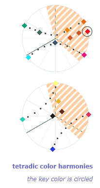
10.7 Tetradic
The last color harmony, the tetradic, is based on four colors, two pairs in complementary relation to each other and the remaining two pairs in analogous relation. The two complementary pairs form the two diagonals of a rectangle or square on the hue circle, with the analogous colors as the two short sides.
To create a tetradic palette, (1) choose a key color at the edge of the hue circle, (2) choose a complementary color opposite it on the hue circle, (3) choose a "warm" or "cool" hue within the analogous color range of the key color, and (4) choose a "warm" or "cool" hue within the analogous color range of the complementary color. You can use any mixture of these colors with themselves and with white, black or a dark neutral.
The usual point of the tetradic harmony is to pit two complementary color pairs against each other, creating tension through the separate complementary contrasts and through the relative dominance of the two pairs. This is especially effective when one complementary axis represents the color of light, and the other the color of surfaces (landscape).
11 "Theory" vs. experience
The artistic control of "color" can be pursued through experience or theory. The diagram shows the basic process tension.
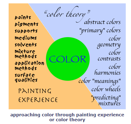
If we take a specific part of a painting, such as a green color patch in a landscape, then we can either view it as the outcome of a material process that involves the manipulation of paints or pigments on specific supports using specific mixing and application techniques, or as the outcome of an intellectual process that assumes planning based on traditional principles of contrast and harmony based on abstract color ideas and fictional primary colors, or geometrical color models used to "predict" color mixtures.
The material process is guided by painting experience, which tends to be a very long, trial and error labor of exploration and imitative training that develops the painter's understanding of the best materials and techniques to produce a specific finished appearance — though why that result occurred is often a mystery. The intellectual process is guided by color theory dogma, which provides sometimes accurate and sometimes inaccurate explanations for why colors appear a certain way, though it does not explain any of the process techniques necessary to produce the desired effect.
The key seems to be in striking a personal balance between practical experience and abstract rules, which everyone can achieve by practicing applying color with the following in mind:
- color is fundamentally a subjective experience that differs considerably from one person to the next;
- color theory rules consist of limited preconceptions based on past experience with specific artistic media, not predictive rules based on abstract scientific principles;
- experience with materials the ultimate standard of best painting practice and the preconceptions you have about how materials behave;
- color theory principles are useful when they accurately summarize your painting and color experience;
- always consider color theory guidance when you are confused by a basic painting problem or design difficulty;
- avoid the empty intellectual game of talking about color theory separate from a specific design or painting problem in relation to a specific design or painting; and
- keep your eyes always open to the effects your materials create, so that theory does not become a limitation to your artistic growth.
Eventually, accumulated experience makes futher experience easier to acquire and understand, and makes theory less of an issue. It is always more difficult to look at the actual behavior of the colors you use than to memorize the simplifed rules of "color theory." But experience, not memorization, is where learning actually takes place.
12 A final note about color theory and color harmony
I'd like to conclude this long page, which has wrestled with many ideas inherited from "color theory", with a few words from John Ruskin, a remarkably gifted artist and art critic.
In his classic tutorial The Elements of Drawing, Ruskin spends some time talking about the problems of color harmony. Here are his thoughts:
There is no better test of your color tones value design being good, than your having made the white in your picture precious, and the black conspicuous....
Nearly all good mixed colors are odd colors. You shall look at a hue in a good painter's work ten minutes before you know what to call it.... If you try to copy it you will find always your color is too warm or too cold.
As to the choice and harmony of colors in general, if you cannot choose and harmonize them by instinct, you will never do it at all. If you need examples of utterly harsh and horrible color, you may find plenty given in treatises on coloring, to illustrate the laws of harmony.
If you want to color beautifully, color as best pleases yourself at quiet times, not so as to catch the eye, nor look as if it were clever or difficult to color in that way, but so that the color may be pleasant to you when you are happy or thoughtful.
If ever any scientific person tells you that two colors are 'discordant,' make a note of the two colors, and put them together whenever you can.
If you enjoy colors, depend upon it you will paint them to a certain point right: or, at least, if you do not enjoy them, you are certain to paint them wrong. If color does not give you intense pleasure, let it alone; depend upon it, you are only tormenting the eyes and senses of people who feel color.
Your power of coloring depends much on your state of health and right balance of mind: when you are fatigued or ill you will not see colors well, and when you are ill-tempered you will not choose them well.
Only observe always this, that the less color you do the work with, the better it will always be.
All this to say that you should take the ideas on this page as guidelines for exploring color rather than as rules for using color. Try the various color schemes for yourself; vary the number of colors you use; try all the schemes with unsaturated colors only. Experiment with altering the schemes to capture the effects of light or mood.
Always do everything to the best of your skill, and in this spirit — "so that the color may be pleasant to you when you are happy or thoughtful" — and your color harmonies will be beautiful without any theory.
Sources
Articles and Websites
- Understanding Color Theory by University of Colorado Boulder - free Coursera course covering the basics of color theory
- Handprint.com: Color – a comprehensive site about color perception, color psychology, color theory, and color mixing (For those interested in learning more about the concepts and application of color theory, I highly recommend starting here. This was the most important reference for my understanding several concepts mentioned throughout this guide.)
- Pantone: Color Fundamentals – a series of articles on the fundamentals of color (This article in particular has a great explanation of color harmony in layman terms)
- Munsell Color: Modern and Traditional Color Theory - great discussion of the division between modern and traditional color theory
- Worqx: Overview of Color Theory - a concise overview of the fundamental concepts of traditional color theory
Books
- Color and Culture: Practice and Meaning from Antiquity to Abstraction by John Gage
- The Science of Art: Optical Themes in Western Art from Brunelleschi to Seurat by Martin Kemp
- Color Categories in Thought and Language edited by C.L. Hardin and Luisa Maffi
- The New Munsell Student Color Set by Joy Turner Luke
- Interaction of Color by Josef Albers
- Theory of Colours by Johann Wolfgang von Goethe
- The Principles of Harmony and Contrast of Colors by Michel-Eugène Chevreul
- Modern Chomatics by Ogden Rood
- Exploring Color (revised edition) by Nita Leland
- Color Right From the Start by Hilary Page
- Color Choices by Stephen Quiller
- Transparent Watercolor Wheel by Jim Kosvanec
- Blue and Yellow Don't Make Green (Second Edition) by Michael Wilcox
- Color Theory Made Easy by Jim Ames
- Zoltan Szabo's Color-by-Color Guide to Watercolor by Zoltan Szabo
- Color In Contemporary Painting by Charles LeClair
Member discussion